type.
Base control
Most controls share these core properties. Depending on the control type, these map to the DOM or CSS rules.Text
Used for simple single-line string values (headings, buttons, short inputs). Supports real-time preview and AI writing generation.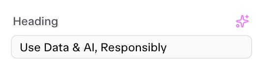
Textarea
Used for multi-line text blocks (descriptions, content bodies). Provides a larger input area.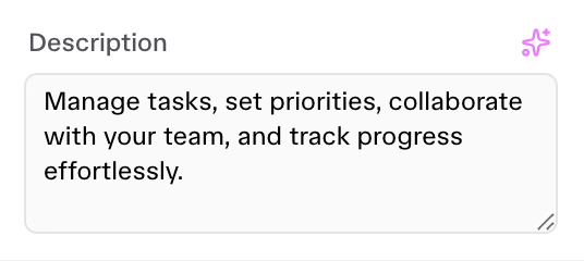
Heading
Used to inject non-editable separator titles in Squeditor sidebar to group related visual settings visually. It is not an input control it just a separator.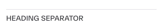
Color
Color picker with alpha support. Can inject CSS variables or apply styles directly.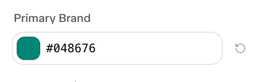
Typography
Selector for global font variables or family assignments.Media
Integration with the Media Library for Images and Videos.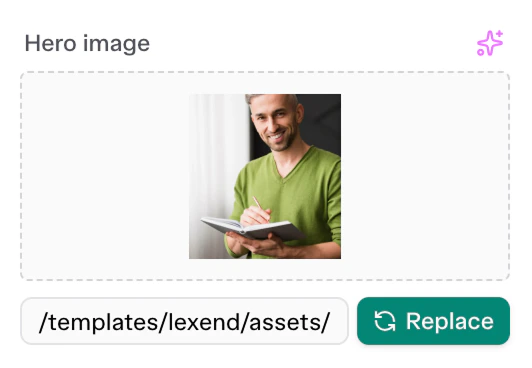
Select
A dropdown menu control for selecting predefined choices.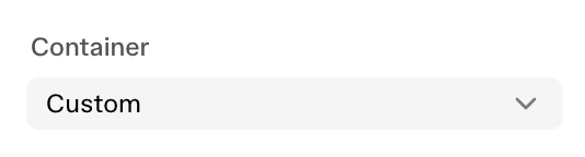
Slider
A responsive range slider control, perfect for widths, text sizing, or capacities.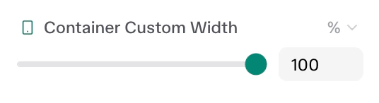
Dimensions
A linked, 4-sided (Top/Right/Bottom/Left) numerical input for margin, padding, or border-radius properties.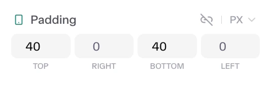
Number
Basic number input component for generic counting variables (like items-per-view) or basic size rules.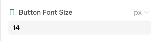
Icon
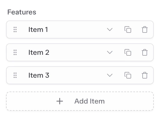
Used to load specific icon classnames directly to DOM elements. Uses an icon picker.Repeater
Complex control used to manage lists of repetitive elements (e.g., FAQ accordions, pricing tiers, testimonial grids). Repeaters load a sub-array of nested Controls for every repeating DOM slice.