> ## Documentation Index
> Fetch the complete documentation index at: https://docs.squeditor.com/llms.txt
> Use this file to discover all available pages before exploring further.
# Controls Reference
> Detailed API reference for all available editor inputs.
Controls are the active input components representing CSS properties or HTML attributes that the template developer allows the user to change. All controls share common base parameters but also have specific configurations depending on their `type`.
## Base control
Most controls share these core properties. Depending on the control type, these map to the DOM or CSS rules.
Unique identifier for the control.
The type of control (e.g., `text`, `media`, `slider`).
Human-readable label for the UI interface.
CSS selector to target elements (e.g., `{{WRAPPER}} h1`).
CSS rules map. Key is selector, value is rule (e.g., `color: {{VALUE}};`).
DOM attribute to modify when mapping directly to HTML
(e.g., `src`, `textContent`).
Default value for the control when first rendered.
Conditional visibility logic evaluated inside Squeditor
(e.g., `"{{layout}} === 'custom'"`).
[Read more about Conditional Display](/editor/components/conditional-display)
Helper text displayed below the control in Squeditor sidebar.
If `true`, forces the label to display on its own row above the input.
Enables AI generation for compatible controls.
Configuration for AI text or media generation defaults.
Learn more about [AI Configuration](/editor/components/ai).
***
## Text
Used for simple single-line string values (headings, buttons, short inputs). Supports real-time preview and AI writing generation.
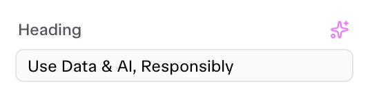 ```json theme={null}
{
"id": "heading_text",
"label": "Heading",
"type": "text",
"selector": "{{WRAPPER}} .title",
"attribute": "textContent",
"default": "Use Data & AI, Responsibly",
"ai_enabled": true,
"ai_config": {
"type": "headline",
"max_length": 40,
"prompt": "Generate a compelling headline for a SaaS business tool",
"variations": 3
},
"label_block": true
}
```
Must be `"text"`.
CSS selector to target elements.
Target attribute (usually `textContent`).
Enables AI writing assistant.
[See AI configuration reference](/editor/components/ai)
***
## Textarea
Used for multi-line text blocks (descriptions, content bodies). Provides a larger input area.
```json theme={null}
{
"id": "heading_text",
"label": "Heading",
"type": "text",
"selector": "{{WRAPPER}} .title",
"attribute": "textContent",
"default": "Use Data & AI, Responsibly",
"ai_enabled": true,
"ai_config": {
"type": "headline",
"max_length": 40,
"prompt": "Generate a compelling headline for a SaaS business tool",
"variations": 3
},
"label_block": true
}
```
Must be `"text"`.
CSS selector to target elements.
Target attribute (usually `textContent`).
Enables AI writing assistant.
[See AI configuration reference](/editor/components/ai)
***
## Textarea
Used for multi-line text blocks (descriptions, content bodies). Provides a larger input area.
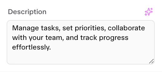 ```json theme={null}
{
"id": "description",
"label": "Description",
"type": "textarea",
"selector": "{{WRAPPER}} .desc",
"attribute": "textContent",
"default": "Unlock your productivity...",
"rows": 4,
"ai_enabled": true
}
```
Must be `"textarea"`.
Number of visible text rows in Squeditor.
Enables AI text generation support.
[See AI configuration reference](/editor/components/ai)
***
## Heading
Used to inject non-editable separator titles in Squeditor sidebar to group related visual settings visually. It is not an input control it just a separator.
```json theme={null}
{
"id": "description",
"label": "Description",
"type": "textarea",
"selector": "{{WRAPPER}} .desc",
"attribute": "textContent",
"default": "Unlock your productivity...",
"rows": 4,
"ai_enabled": true
}
```
Must be `"textarea"`.
Number of visible text rows in Squeditor.
Enables AI text generation support.
[See AI configuration reference](/editor/components/ai)
***
## Heading
Used to inject non-editable separator titles in Squeditor sidebar to group related visual settings visually. It is not an input control it just a separator.
 ```json theme={null}
{
"id": "your_heading",
"type": "heading",
"label": "Heading Separator",
"separator": "before"
}
```
Must be `"heading"`.
The text to display as a heading in Squeditor sidebar.
Add a line separator `"before"` or `"after"` the heading.
***
## Color
Color picker with alpha support. Can inject CSS variables or apply styles directly.
```json theme={null}
{
"id": "your_heading",
"type": "heading",
"label": "Heading Separator",
"separator": "before"
}
```
Must be `"heading"`.
The text to display as a heading in Squeditor sidebar.
Add a line separator `"before"` or `"after"` the heading.
***
## Color
Color picker with alpha support. Can inject CSS variables or apply styles directly.
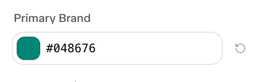 ```json theme={null}
{
"id": "primary",
"label": "Primary Brand",
"type": "color",
"default": "#048676"
}
```
Must be `"color"`.
Default hex or rgba color code.
Map of CSS rules (e.g., `"background-color: {{VALUE}};"`).
***
## Typography
Selector for global font variables or family assignments.
```json theme={null}
{
"id": "heading",
"label": "Headings Font",
"type": "typography",
"default": "Sunsive"
}
```
Must be `"typography"`.
Default font-family name.
***
## Media
Integration with the Media Library for Images and Videos.
```json theme={null}
{
"id": "primary",
"label": "Primary Brand",
"type": "color",
"default": "#048676"
}
```
Must be `"color"`.
Default hex or rgba color code.
Map of CSS rules (e.g., `"background-color: {{VALUE}};"`).
***
## Typography
Selector for global font variables or family assignments.
```json theme={null}
{
"id": "heading",
"label": "Headings Font",
"type": "typography",
"default": "Sunsive"
}
```
Must be `"typography"`.
Default font-family name.
***
## Media
Integration with the Media Library for Images and Videos.
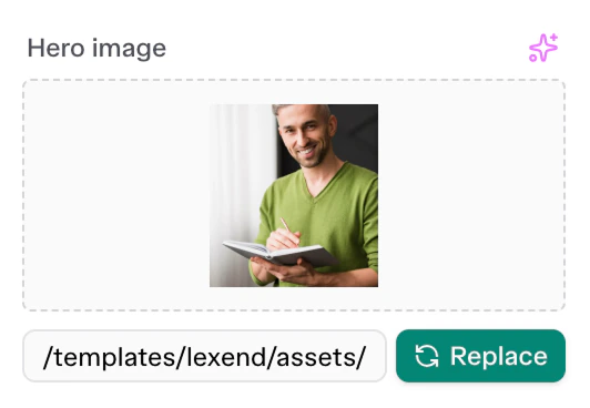 ```json theme={null}
{
"id": "user_image",
"label": "Image",
"type": "media",
"selector": "img",
"attribute": "src",
"media_type": "image",
"default": "/templates/lexend/assets/images/avatars/02.jpg",
"ai_enabled": true,
"ai_config": {
"type": "image",
"aspect_ratio": "1:1"
}
}
```
Must be `"media"`.
`"image"`, `"video"`, or `"all"`.
Max file size allowed in bytes (e.g., `5242880` for 5MB).
Enables AI image generation.
[See AI configuration reference](/editor/components/ai)
***
## Select
A dropdown menu control for selecting predefined choices.
```json theme={null}
{
"id": "user_image",
"label": "Image",
"type": "media",
"selector": "img",
"attribute": "src",
"media_type": "image",
"default": "/templates/lexend/assets/images/avatars/02.jpg",
"ai_enabled": true,
"ai_config": {
"type": "image",
"aspect_ratio": "1:1"
}
}
```
Must be `"media"`.
`"image"`, `"video"`, or `"all"`.
Max file size allowed in bytes (e.g., `5242880` for 5MB).
Enables AI image generation.
[See AI configuration reference](/editor/components/ai)
***
## Select
A dropdown menu control for selecting predefined choices.
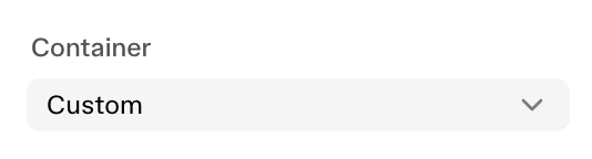 ```json theme={null}
{
"id": "section_container",
"label": "Container",
"type": "select",
"selector": "{{WRAPPER}} .section-outer > *",
"attribute": "class",
"options": [
{ "value": "container", "label": "Default" },
{ "value": "container-fluid", "label": "Full Width" },
{ "value": "custom", "label": "Custom" }
],
"default": "container"
}
```
Must be `"select"`.
Array containing object choices for the dropdown.
The raw code value inserted.
The human-readable title of the option.
***
## Slider
A responsive range slider control, perfect for widths, text sizing, or capacities.
```json theme={null}
{
"id": "section_container",
"label": "Container",
"type": "select",
"selector": "{{WRAPPER}} .section-outer > *",
"attribute": "class",
"options": [
{ "value": "container", "label": "Default" },
{ "value": "container-fluid", "label": "Full Width" },
{ "value": "custom", "label": "Custom" }
],
"default": "container"
}
```
Must be `"select"`.
Array containing object choices for the dropdown.
The raw code value inserted.
The human-readable title of the option.
***
## Slider
A responsive range slider control, perfect for widths, text sizing, or capacities.
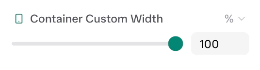 ```json theme={null}
{
"id": "section_container_width",
"label": "Container Custom Width",
"type": "slider",
"responsive": true,
"size_units": ["px", "%", "vw", "rem"],
"range": {
"px": { "min": 200, "max": 1600, "step": 8 },
"%": { "min": 0, "max": 100, "step": 1 }
},
"default": {
"desktop": { "size": 1200, "unit": "px" },
"tablet": { "size": 90, "unit": "%" },
"mobile": { "size": 100, "unit": "%" }
},
"selectors": {
"{{WRAPPER}} .section-outer > *": "max-width: {{SIZE}}{{UNIT}} !important; margin: 0 auto !important;"
}
}
```
Must be `"slider"`.
If true, lets users set separate mobile/tablet/desktop values.
Allowed CSS units (`["px", "%", "em", "vw"]`).
Object mapping min, max, and step validation limits for each unit type.
A plain number or a responsive mapping object defining default sizes per device.
***
## Dimensions
A linked, 4-sided (Top/Right/Bottom/Left) numerical input for margin, padding, or border-radius properties.
```json theme={null}
{
"id": "section_container_width",
"label": "Container Custom Width",
"type": "slider",
"responsive": true,
"size_units": ["px", "%", "vw", "rem"],
"range": {
"px": { "min": 200, "max": 1600, "step": 8 },
"%": { "min": 0, "max": 100, "step": 1 }
},
"default": {
"desktop": { "size": 1200, "unit": "px" },
"tablet": { "size": 90, "unit": "%" },
"mobile": { "size": 100, "unit": "%" }
},
"selectors": {
"{{WRAPPER}} .section-outer > *": "max-width: {{SIZE}}{{UNIT}} !important; margin: 0 auto !important;"
}
}
```
Must be `"slider"`.
If true, lets users set separate mobile/tablet/desktop values.
Allowed CSS units (`["px", "%", "em", "vw"]`).
Object mapping min, max, and step validation limits for each unit type.
A plain number or a responsive mapping object defining default sizes per device.
***
## Dimensions
A linked, 4-sided (Top/Right/Bottom/Left) numerical input for margin, padding, or border-radius properties.
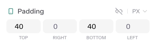 ```json theme={null}
{
"id": "section_padding",
"label": "Padding",
"type": "dimensions",
"responsive": true,
"size_units": ["px", "%", "em", "rem", "vh", "vw"],
"default": {
"desktop": { "top": 80, "right": 0, "bottom": 80, "left": 0, "unit": "px", "isLinked": false },
"tablet": { "top": 64, "right": 0, "bottom": 64, "left": 0, "unit": "px", "isLinked": false },
"mobile": { "top": 40, "right": 0, "bottom": 40, "left": 0, "unit": "px", "isLinked": false }
},
"selectors": {
"{{WRAPPER}} .section-outer": "padding: {{TOP}}{{UNIT}} {{RIGHT}}{{UNIT}} {{BOTTOM}}{{UNIT}} {{LEFT}}{{UNIT}} !important;"
}
}
```
Must be `"dimensions"`.
Enables breakpoint behavior.
Available units.
Maps values `top`, `right`, `bottom`, `left`, `unit`, and boolean `isLinked`.
***
## Number
Basic number input component for generic counting variables (like items-per-view) or basic size rules.
```json theme={null}
{
"id": "section_padding",
"label": "Padding",
"type": "dimensions",
"responsive": true,
"size_units": ["px", "%", "em", "rem", "vh", "vw"],
"default": {
"desktop": { "top": 80, "right": 0, "bottom": 80, "left": 0, "unit": "px", "isLinked": false },
"tablet": { "top": 64, "right": 0, "bottom": 64, "left": 0, "unit": "px", "isLinked": false },
"mobile": { "top": 40, "right": 0, "bottom": 40, "left": 0, "unit": "px", "isLinked": false }
},
"selectors": {
"{{WRAPPER}} .section-outer": "padding: {{TOP}}{{UNIT}} {{RIGHT}}{{UNIT}} {{BOTTOM}}{{UNIT}} {{LEFT}}{{UNIT}} !important;"
}
}
```
Must be `"dimensions"`.
Enables breakpoint behavior.
Available units.
Maps values `top`, `right`, `bottom`, `left`, `unit`, and boolean `isLinked`.
***
## Number
Basic number input component for generic counting variables (like items-per-view) or basic size rules.
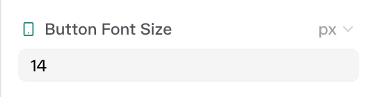 ```json theme={null}
{
"id": "form_submit_fontSize_new",
"label": "Button Font Size",
"type": "number",
"responsive": true,
"size_units": ["px", "em", "rem"],
"min": 10,
"max": 50,
"default": {
"desktop": { "size": 18, "unit": "px" }
},
"selectors": {
"{{WRAPPER}} .cta-button": "font-size: {{SIZE}}{{UNIT}} !important;"
}
}
```
Must be `"number"`.
Minimum value.
Maximum valid value.
Boolean layout responsive state.
***
## Icon
Used to load specific icon classnames directly to DOM elements. Uses an icon picker.
```json theme={null}
{
"id": "feat_icon",
"label": "Icon",
"type": "icon",
"selector": ".icon-box > *",
"attribute": "className",
"default": "unicon-search",
"label_block": false
}
```
Must be `"icon"`.
The literal DOM attribute that stores the icon font prefix (e.g. `"className"`).
String of the default CSS icon class.
***
## Repeater
Complex control used to manage lists of repetitive elements (e.g., FAQ accordions, pricing tiers, testimonial grids). Repeaters load a sub-array of nested Controls for every repeating DOM slice.
```json theme={null}
{
"id": "form_submit_fontSize_new",
"label": "Button Font Size",
"type": "number",
"responsive": true,
"size_units": ["px", "em", "rem"],
"min": 10,
"max": 50,
"default": {
"desktop": { "size": 18, "unit": "px" }
},
"selectors": {
"{{WRAPPER}} .cta-button": "font-size: {{SIZE}}{{UNIT}} !important;"
}
}
```
Must be `"number"`.
Minimum value.
Maximum valid value.
Boolean layout responsive state.
***
## Icon
Used to load specific icon classnames directly to DOM elements. Uses an icon picker.
```json theme={null}
{
"id": "feat_icon",
"label": "Icon",
"type": "icon",
"selector": ".icon-box > *",
"attribute": "className",
"default": "unicon-search",
"label_block": false
}
```
Must be `"icon"`.
The literal DOM attribute that stores the icon font prefix (e.g. `"className"`).
String of the default CSS icon class.
***
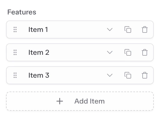
## Repeater
Complex control used to manage lists of repetitive elements (e.g., FAQ accordions, pricing tiers, testimonial grids). Repeaters load a sub-array of nested Controls for every repeating DOM slice.
 ```json theme={null}
{
"id": "faq_repeater",
"label": "Items",
"type": "repeater",
"selector": "{{WRAPPER}} ul.uc-accordion-divider > li",
"fields": [
{
"id": "question",
"label": "Question",
"type": "text",
"selector": ".uc-accordion-title",
"attribute": "textContent"
},
{
"id": "answer",
"label": "Answer",
"type": "textarea",
"selector": ".uc-accordion-content",
"attribute": "textContent"
}
],
"default": [
{ "question": "Example?", "answer": "Example answer." }
],
"title_field": "question",
"prevent_empty": 1
}
```
Must be `"repeater"`.
The exact CSS rule that selects the specific repetitive wrapper inside your parent block.
An array containing child Controls acting as template schema variables.
An array grouping identical properties mapped from `fields` simulating live items.
Which relative variable child ID identifies the label assigned to its active row in array configuration mode.
Minimum threshold volume (defaults restrict clearing rows below boundary).
Limits the maximum objects loading automatically before enabling slicing capabilities.
```json theme={null}
{
"id": "faq_repeater",
"label": "Items",
"type": "repeater",
"selector": "{{WRAPPER}} ul.uc-accordion-divider > li",
"fields": [
{
"id": "question",
"label": "Question",
"type": "text",
"selector": ".uc-accordion-title",
"attribute": "textContent"
},
{
"id": "answer",
"label": "Answer",
"type": "textarea",
"selector": ".uc-accordion-content",
"attribute": "textContent"
}
],
"default": [
{ "question": "Example?", "answer": "Example answer." }
],
"title_field": "question",
"prevent_empty": 1
}
```
Must be `"repeater"`.
The exact CSS rule that selects the specific repetitive wrapper inside your parent block.
An array containing child Controls acting as template schema variables.
An array grouping identical properties mapped from `fields` simulating live items.
Which relative variable child ID identifies the label assigned to its active row in array configuration mode.
Minimum threshold volume (defaults restrict clearing rows below boundary).
Limits the maximum objects loading automatically before enabling slicing capabilities.